

Desperate times call for desperate measures…So what am I talking about? Let me explain.
I came to Salt Spring Island last week to spend the weekend and a couple extra days with my Mum. I was to head home on Tuesday afternoon. Well, on that morning, we woke to this!!
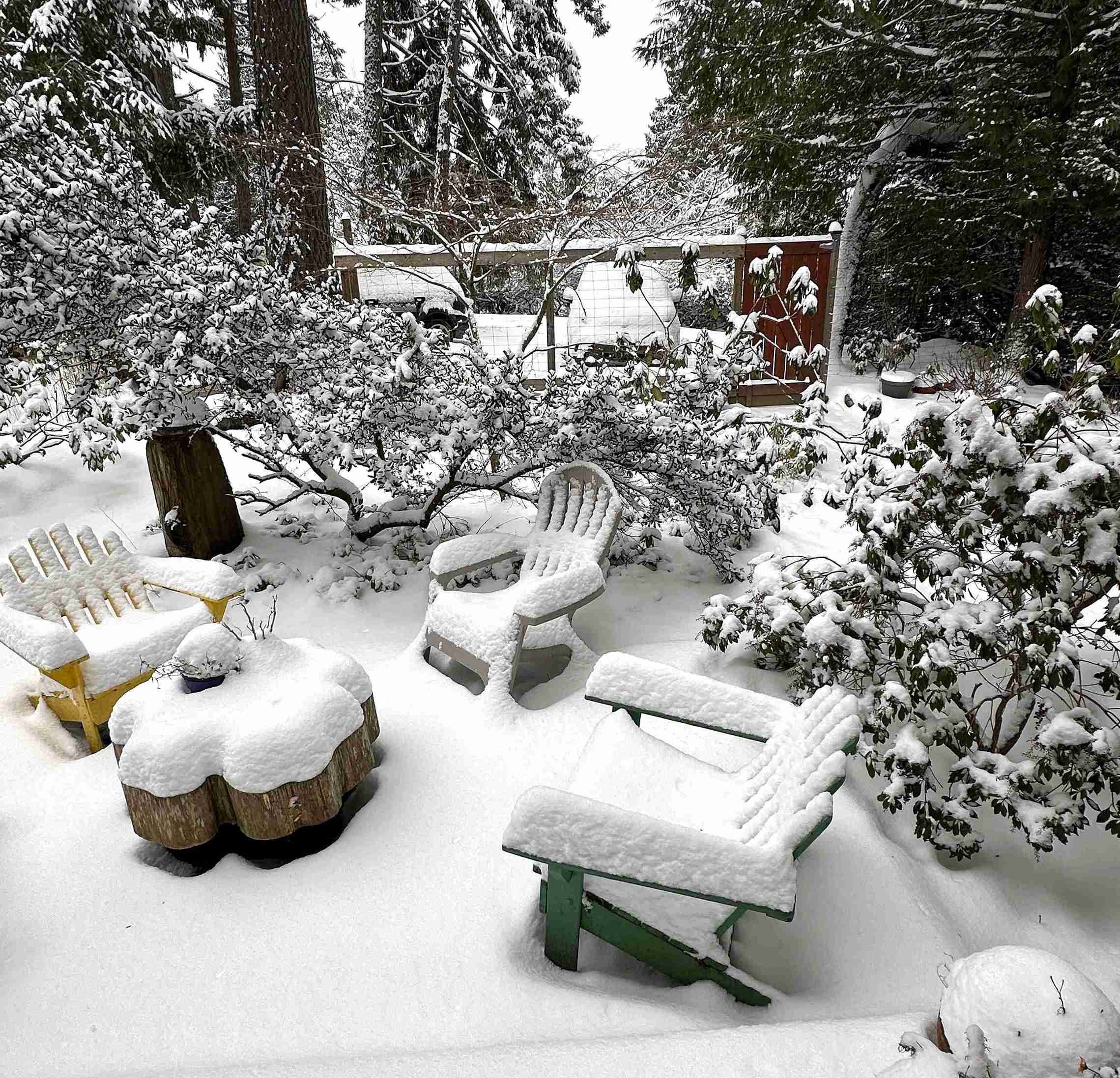
I realise that to many of you, this may not be a big deal but to those of us living on the southern coast of British Columbia in Canada, this is a once a year sight! Snow is something that stops us in our tracks. Literally. Since Tuesday, the temperatures have remained just below zero celsius (32F) with cloudy skies (so no sun to start everything melting) which basically meant the snow wasn’t going anywhere! It made sense to just stay put.
My plan had been to work on a pastel painting once back home, and write about it for this post. That was a fine and dandy plan for my studio but here on Salt Spring where I had no pastels and no paper, I wasn’t sure what to do!
Desperate times indeed.
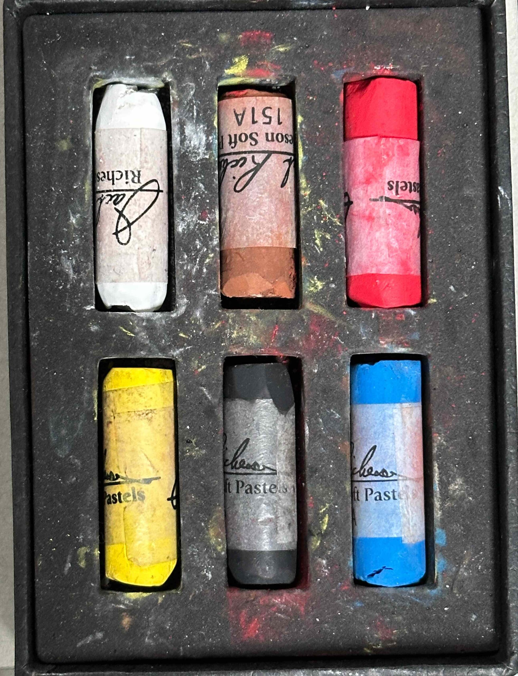
As I pondered, I recalled that Mum, who works in oils and watercolours, had, for fun, purchased a few pastels a number of months ago. Could we find them?
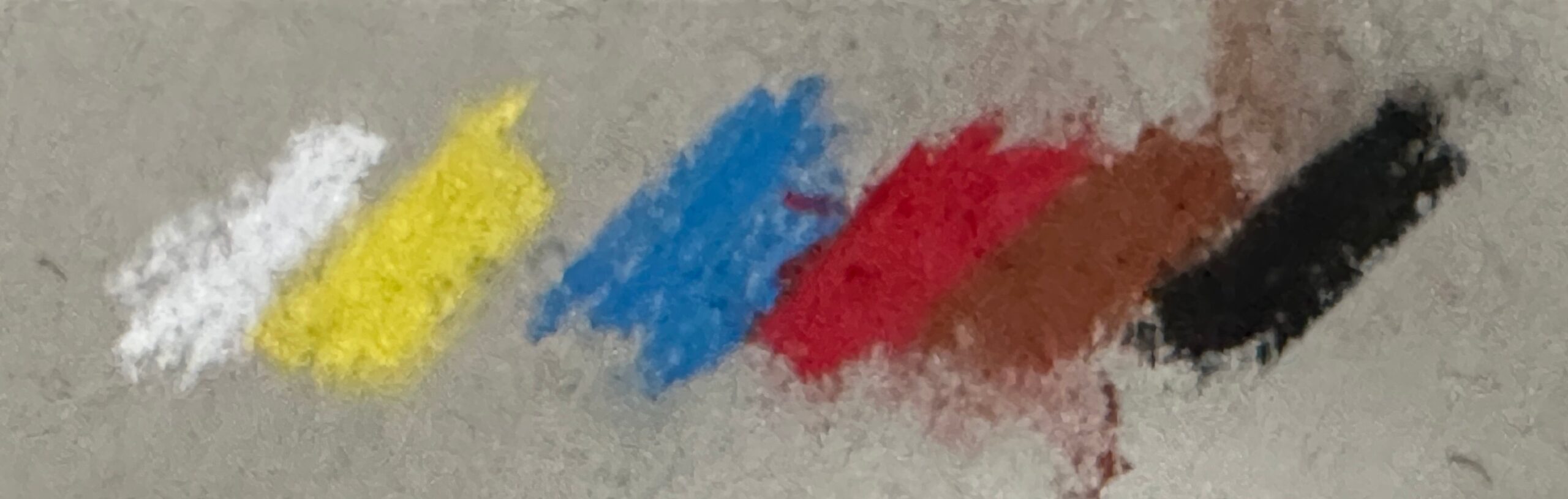
The box of six Richeson pastels was easily found and I got to work making colour swatches to determine the value range – turns out I had two lights, three middle values, and one dark to work with. So we’re talking about a seriously limited palette!
And what about paper? Mum had a Strathmore Toned Sketchbook and I figured that was my best option.
Desperate measures!

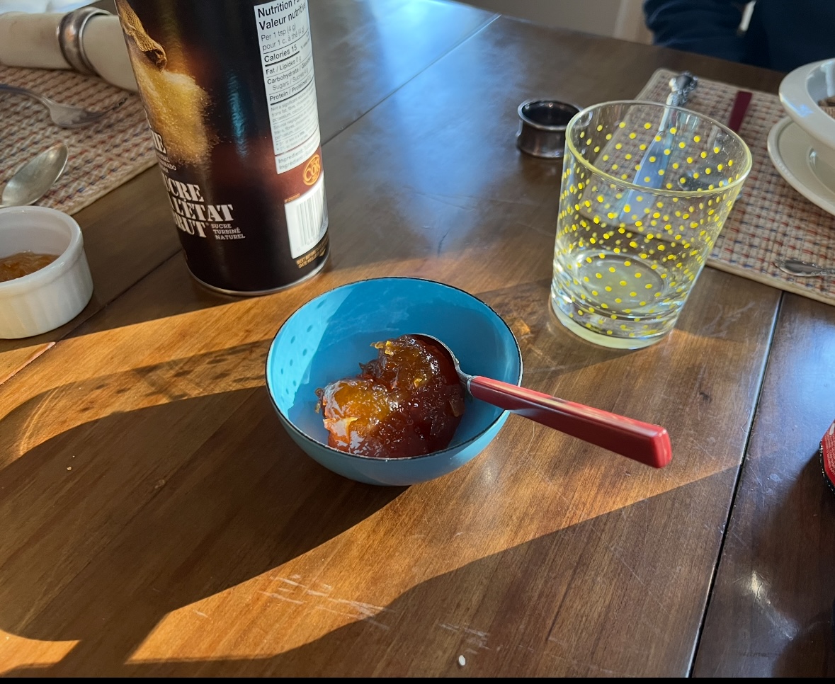
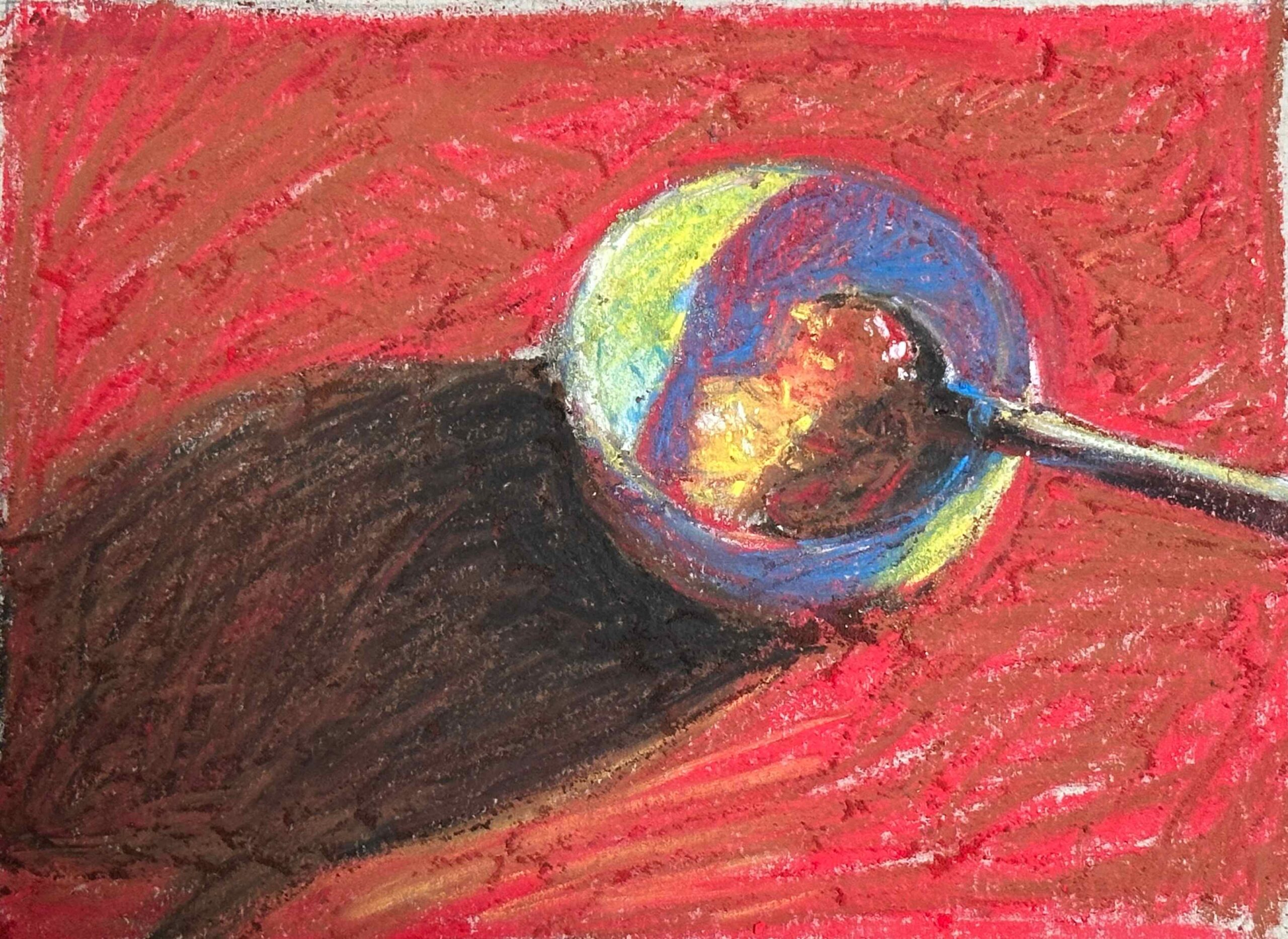
With tools in hand, I then needed to select a reference photo. I wanted to keep it simple so I could work quickly through the process AND select an image not filled with greens. I gave myself 10 minutes to find source material as I need to get cracking.
This was the image that stopped me:
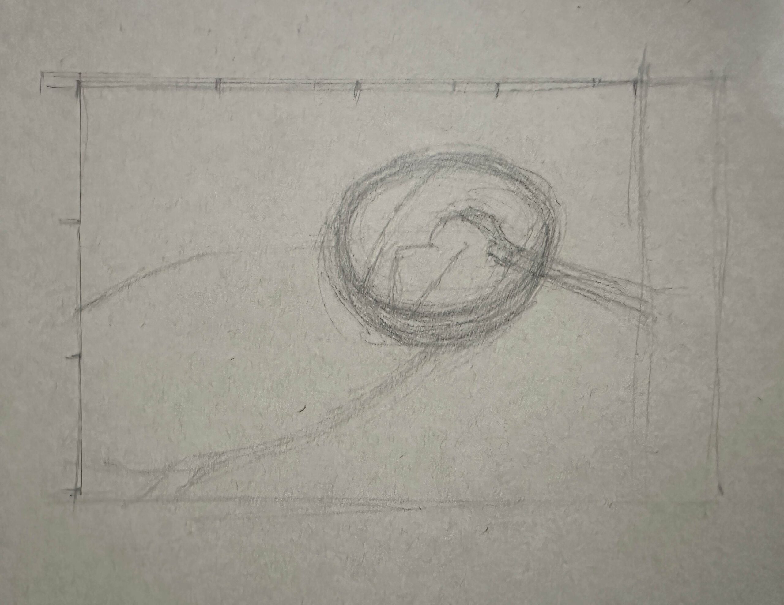
Next up was to create a thumbnail to decide on design, format, and value structure. After creating it, I wasn’t sure if I should cut off the spoon handle so I tried another option – you can see that below the first try. That’s the one I decided to go with. I cropped it slightly to create a 3:4 ratio.
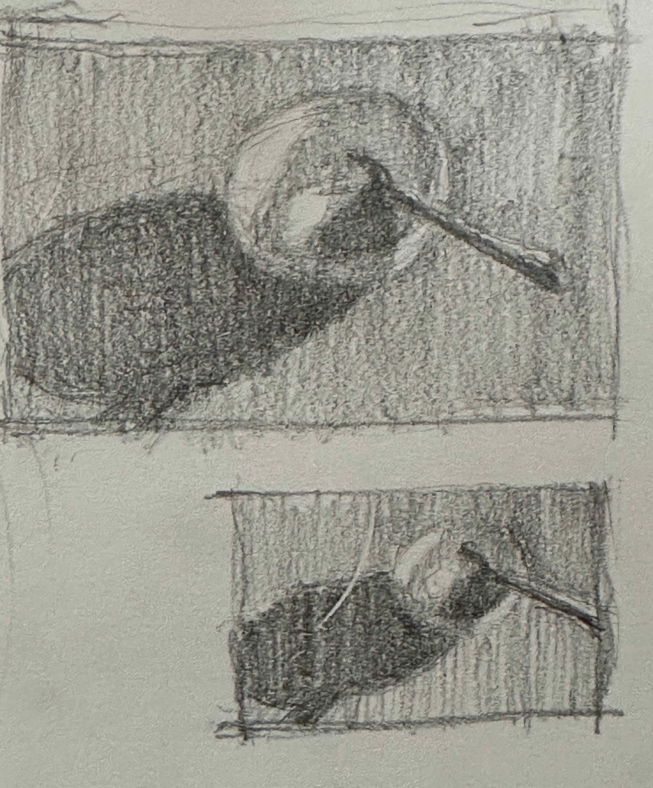
I drew up the image with an HB pencil – again, something I wouldn’t normally do. Vine charcoal is my favoured medium for the initial drawing.
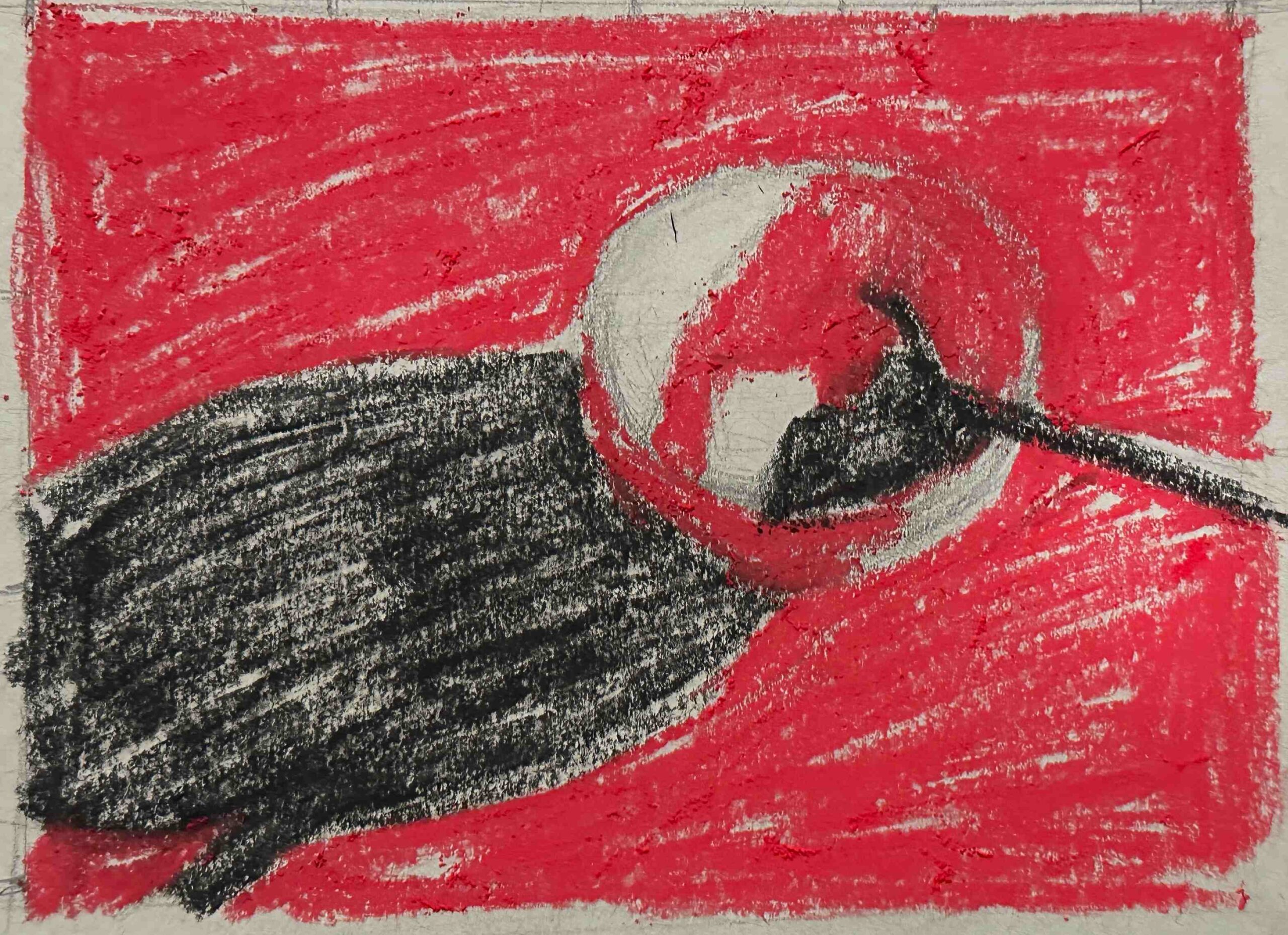
And then, it was time to get started! Black was my only option for the darks so I got that down first. I chose the red for the middle value. That left only the light to add.
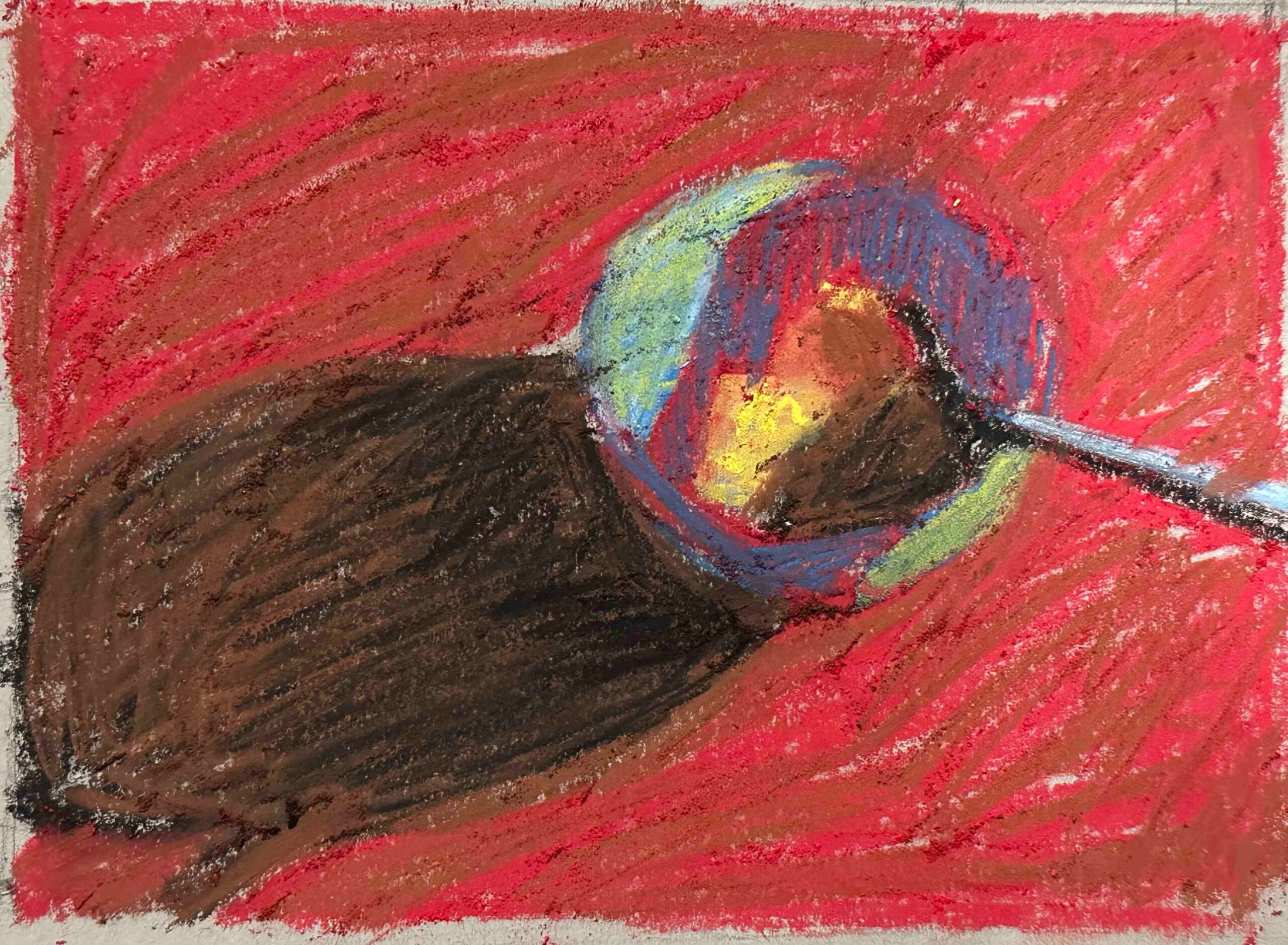
Once I applied the yellow for the light areas, I began to add layers. To give a feeling of the blue bowl, I added blue pastel over the yellow. To add some colour and warmth to the cast shadow, I added brown to the black. Yes, I applied a mid-value over a light value and a mid-value over a dark value respectively. Eeps!
Now any of you who’ve been a student of mine know that I really try not to mix my values unless I really need to. Well, this was a time of desperate need! It’s harder to work this way because you really have to constantly remind yourself of the value structure as decided in your thumbnail as it’s easy to start moving down a differing value path!
Happily, in other areas, I could keep to my usual way of working similar value over similar value eg the brown over the red on the table area and the blue over the red in the shadow side of the bowl.
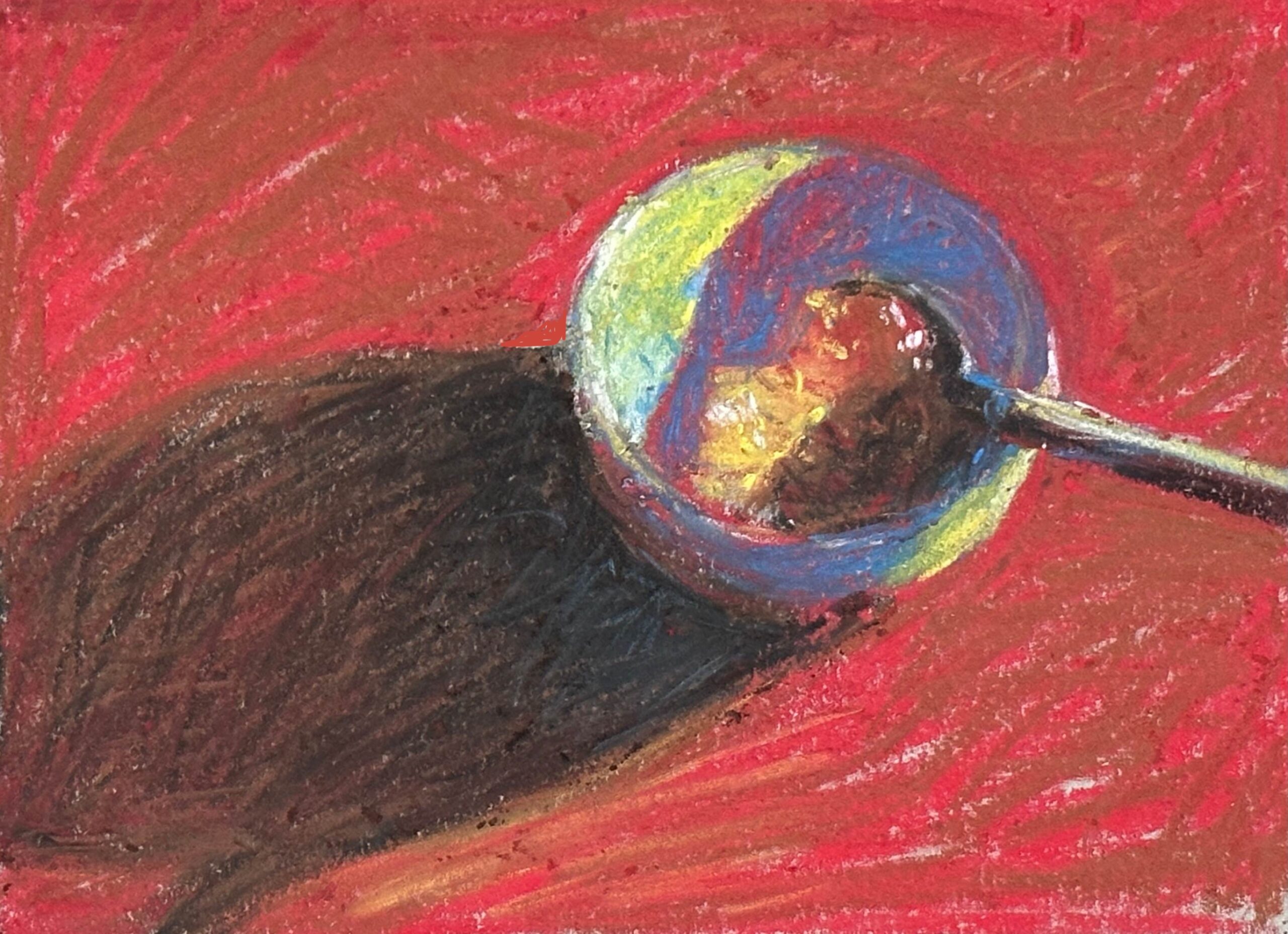
I then started refining the shapes and colour nuances.
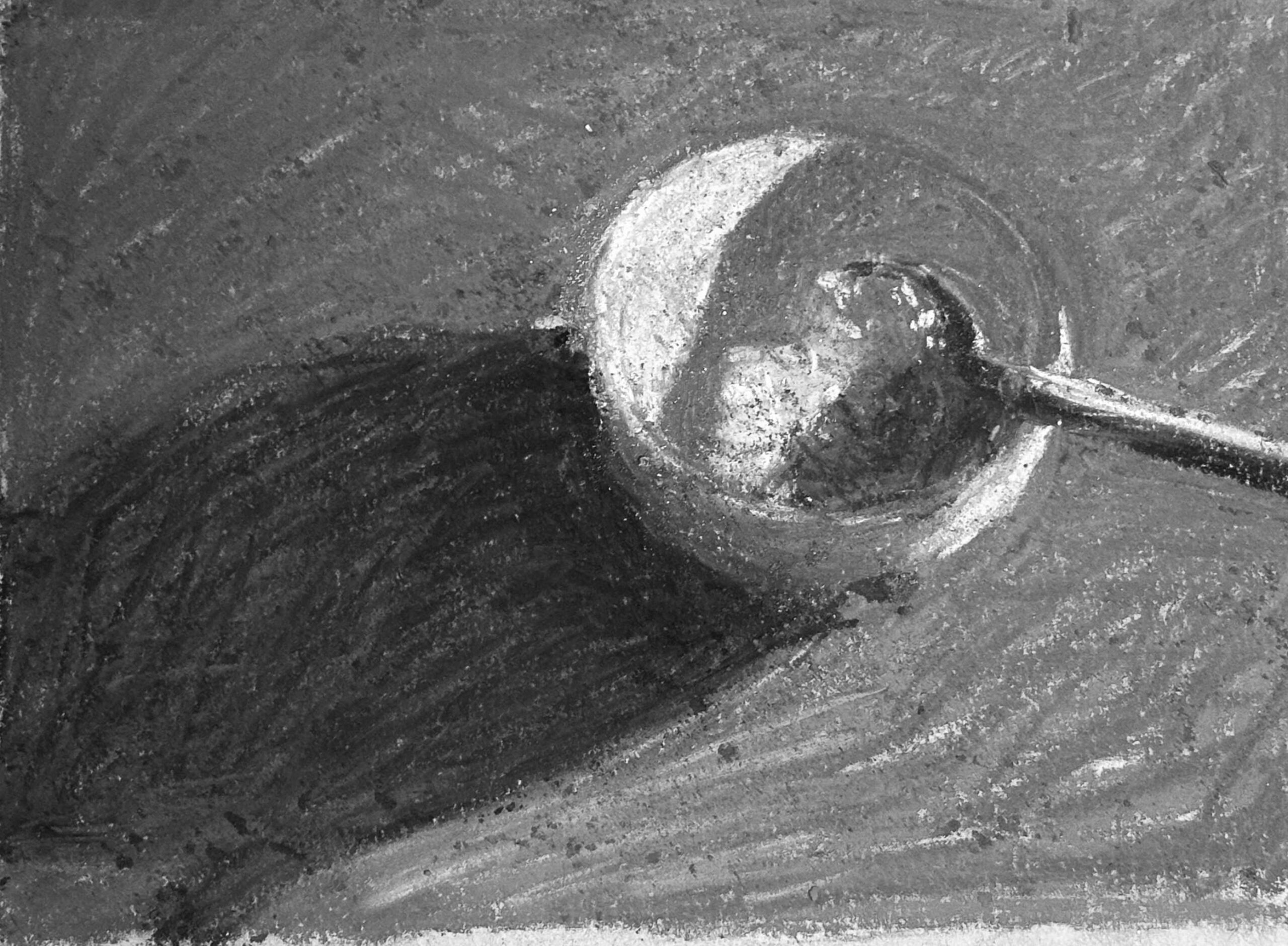
It was time to check the piece in black and white, to see if I’d retained my value choices made in my thumbnail. And I was pleased to see I had.
I added a bit of blue into the darkest area of the cast shadow, assuming some reflected light from the bowl, and decided to call it quits.
A few thoughts about this experience of desperate times call for desperate measures:
- The sketchbook paper really doesn’t allow for much build up of pastel but it was useful in a pinch.
- With no easel available, I worked flat – desperate measures! My happy place is working upright so this was a real push into discomfort for me!
- The pastels were fine but the colour and value range severely limited. Even so, if you’re willing to let go of colour accuracy and matching and you have a range of light, middle, and dark values, it is possible to put something together!
- One other thing. I’m used to predominantly using the side of the pastel in a painterly way. As these weren’t my pastels, I didn’t want to strip the paper off and break them. That led me to using the tip of the pastel which creates a linear stroke. This is actually something I’m planning to bring back into my work – the idea of more visible mark-making. So necessity led to this positive payoff!
Like I said at the start, desperate times call for desperate measures! And sometimes, that can be a good thing, getting you out of your habits, familiarity, and comfort zone. The “forcing” of a different way of working can actually be to your artistic growth advantage. No matter the result, it’s always a good idea to experiment once in a while and see what learning you gain.
And that’s it for this time! I’d love to hear your thoughts – what did you think of the process and outcome? Have you ever had a situation that you might call, in art, a desperate time that called for desperate measures? I’d love to know so be sure to leave a comment!
Until next time,
~ Gail


12 thoughts on “Desperate Times Call For Desperate Measures…In Art”
I love how flexible you are. You always are willing to push boundaries and go with the present moment. Also great how you find the positive aspects of the experience. Finding the magic.
Thanks so much Linda. Good to hear from you!
And yeah, finding the magic indeed!!
As much as I like buying more pastels (and acrylics, and pencils, and brushes…) we can make pretty good art with less. I have the Unison Basic Half Sticks set and it is – truly – all I need! and easy to travel with when I want to take it somewhere. Thanks for reminding us that we don’t need much to make good art.
Hey Angie, I hear you about liking to buy art materials! And yet…and yet…we often have all we need to create! Love that you make do with a Unison Colour Basic set and like you say, soooo easy to travel with!
This is wonderful, Gail! I have been in a funk and thinking it was so much easier when I had less, knew less, and expected less. Then I read about you making it work with the present. I love your positive take on challenges. The magic does not need ideal conditions to appear!
Yeah baby!!
Gosh we can be so hard on ourselves can’t we?! And yet maybe we just need to do, get painting in the moment with no expectation and all that we have to hand in the moment.
I like that you pulled together a nice picture with limited supplies! BTW, I actually use that specific sketchbook for sketching in pastel. I have found that if I rough up the paper with a bit of sandpaper, it actually holds at least a couple layers of pastel. I then use one half of an 8.5X11″ plastic sleeve over each page. Travel ready!
Betsy
Hey Betsy, that’s so cool! Thanks for the tip to rough up the page. I do love this sketchbook for making black and white sketches but never gone beyond that until this experience. And then there’s the way you protect your pastel. Thanks!
Such a great lesson in improvisation and going with the flow! You very effectively and simply demonstrate the importance of composition (and thumbnails , of course!) and the power of values. Very inspiring as always, and I love the result!
Thank you, Gail!
Thanks Jo! I appreciate you listing all you’ve come away with 😁
Hi Gail. I live in Wales UK and am used to snow once in a while. Your pastel drawing is very inspirational and an idea that I will try out myself. I broke my wrist a few years ago and using my other hand to draw also produced interesting results! Keep going I love your stuff. Sara
Hey Sara, thanks for sharing about what you needed to do when you had a broken wrist. Necessity pushes us where we may not normally go!
And a big thank you for your encouragement 😊